Behind fashion, design, makeup, branding, and even technology, there is one invisible yet powerful force at work—color.
Colors do much more than please the eye. They influence human mood, emotions, productivity, and even decision-making. That is why every year the Pantone Color Institute studies global psychology, culture, technology, and social change to forecast the colors that will define the future.
For 2026, Pantone’s color direction is not just about aesthetics. It reflects a world dealing with rapid technological shifts, artificial intelligence, environmental concerns, emotional fatigue, and the human desire for calm and balance.
The colors of 2026 tell a deeper story—one of peace, simplicity, hope, and reconnection with nature.
The Psychology Behind Pantone’s 2026 Color Direction
The world today is moving faster than ever. War, climate change, digital overload, AI-driven lifestyles, and constant online presence have created a sense of mental exhaustion. In response, Pantone’s 2026 palette focuses on colors that:
- Calm the mind
- Restore emotional balance
- Encourage optimism
- Support sustainability and minimalism
- Bridge technology with humanity
Pantone highlights three core themes for 2026:
Calm Tech | Neo-Nature | Warm Minimalism
Let’s explore the colors that will dominate 2026—and how they will shape fashion, beauty, interiors, and branding.
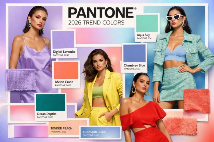
1. Tranquil Blue — Calm in a Digital World
Pantone considers Tranquil Blue one of the strongest colors for 2026. It is a soft, soothing blue with a gentle depth.
Why It Will Trend
- Blue is scientifically proven to reduce stress and increase focus
- It offers mental relief from screen fatigue and digital overload
- It symbolizes trust, clarity, and calmness
Where You’ll See It
- Tech products and user interfaces
- Modern office walls and workspaces
- Websites and digital branding
- Fashion: sarees, kurtis, suits, minimal wear
- Beauty trends like soft blue eyeliner
For those who love understated elegance, Tranquil Blue will be a timeless choice.
2. Urban Olive — Where Nature Meets the City
Urban Olive is a muted, earthy green inspired by nature yet refined for modern living.
Why It Will Trend
- Growing interest in eco-friendly and sustainable lifestyles
- A desire to bring nature into urban spaces
- Olive tones evoke balance, calm, and quiet luxury
Everyday Use
- Home interiors and wall colors
- Furniture and décor accessories
- Minimalist fashion pieces
In 2026, Urban Olive will become a “must-have” shade for home design and conscious fashion.
3. Soft Apricot — Warmth with Modern Sensibility
Pantone predicts that emotional comfort will be a major design focus in the future—and Soft Apricot perfectly reflects that idea.
This gentle peach-toned shade brings warmth without being overpowering.
Why It Will Be Popular
- Creates a sense of happiness and emotional ease
- Complements most skin tones
- Adds warmth to minimalist aesthetics
Where It Fits Best
- Sarees and ethnic wear
- Makeup: blush, nail polish, soft glam looks
- Restaurants and hospitality interiors
The beauty industry is likely to embrace apricot makeup looks as a signature trend in 2026.
4. Digital Lavender — The Color of the Future
Already popular in recent years, Digital Lavender will become even more influential in 2026.
Why It Matters
- Symbolizes innovation, imagination, and AI-driven creativity
- Encourages calm thinking and emotional balance
- Associated with futuristic and tech-forward branding
Research shows lavender tones reduce anxiety and promote creative thinking.
Style Impact
- Fashion: sarees, gowns, hoodies, fusion wear
- Tech branding and digital products
- Youth-driven beauty and lifestyle trends
Digital Lavender bridges technology and emotion—a key theme of the future.
5. Sunset Copper — A New Definition of Luxury
Sunset Copper is a warm metallic shade that blends tradition with modern elegance.
Why It Will Trend
- Metallic tones are making a refined comeback
- Represents richness, craftsmanship, and heritage
- Perfect balance of luxury and warmth
Cultural Influence
In South Asian fashion, copper tones already symbolize prosperity and celebration. By 2026, Sunset Copper sarees and lehengas are expected to dominate wedding seasons.
6. Optimistic Yellow — The Color of Hope
In times of uncertainty, Pantone often introduces a color that represents positivity. For 2026, that color is Optimistic Yellow.
Why It Will Rise
- Symbolizes hope, energy, and confidence
- Uplifts mood instantly
- Highly effective in branding and advertising
Where It Will Shine
- Festive fashion and cultural events
- Seasonal collections
- Brand visuals and marketing campaigns
From celebrations to creative spaces, Optimistic Yellow will bring brightness to everyday life.
How These Colors Will Shape Life in Bangladesh
As Bangladesh closely follows global and South Asian fashion trends, these colors will quickly influence local markets:
- Soft blue, lavender, and peach shades in sarees and gowns
- Olive and apricot tones in home décor
- Sunset Copper and yellow are dominating weddings and festivals
- Pastel-focused makeup trends
- Tech brands using blue and lavender in UI/UX design
Colors as the Language of Time
Colors are more than trends—they are a reflection of society’s emotions.
Pantone’s 2026 color direction tells us one thing clearly:
People are seeking calm over chaos, warmth over excess, and meaning over noise.
Whether in fashion, interiors, branding, or beauty, these colors offer a way to express balance, optimism, and modern identity.
In 2026, color will not just define style—
It will become a powerful form of self-expression.


